Let Your App Use all the Extra Screen Space on iPhone X
Great size, glass on glass on stainless steel design, wireless charging using Qi standard, fantastic gesture-based navigation, IP67 water resistant, convenient face ID, and the best camera I've ever owned. But topping the list is the screen; gorgeous, highly color accurate OLED that makes you think you're touching the very pixels.
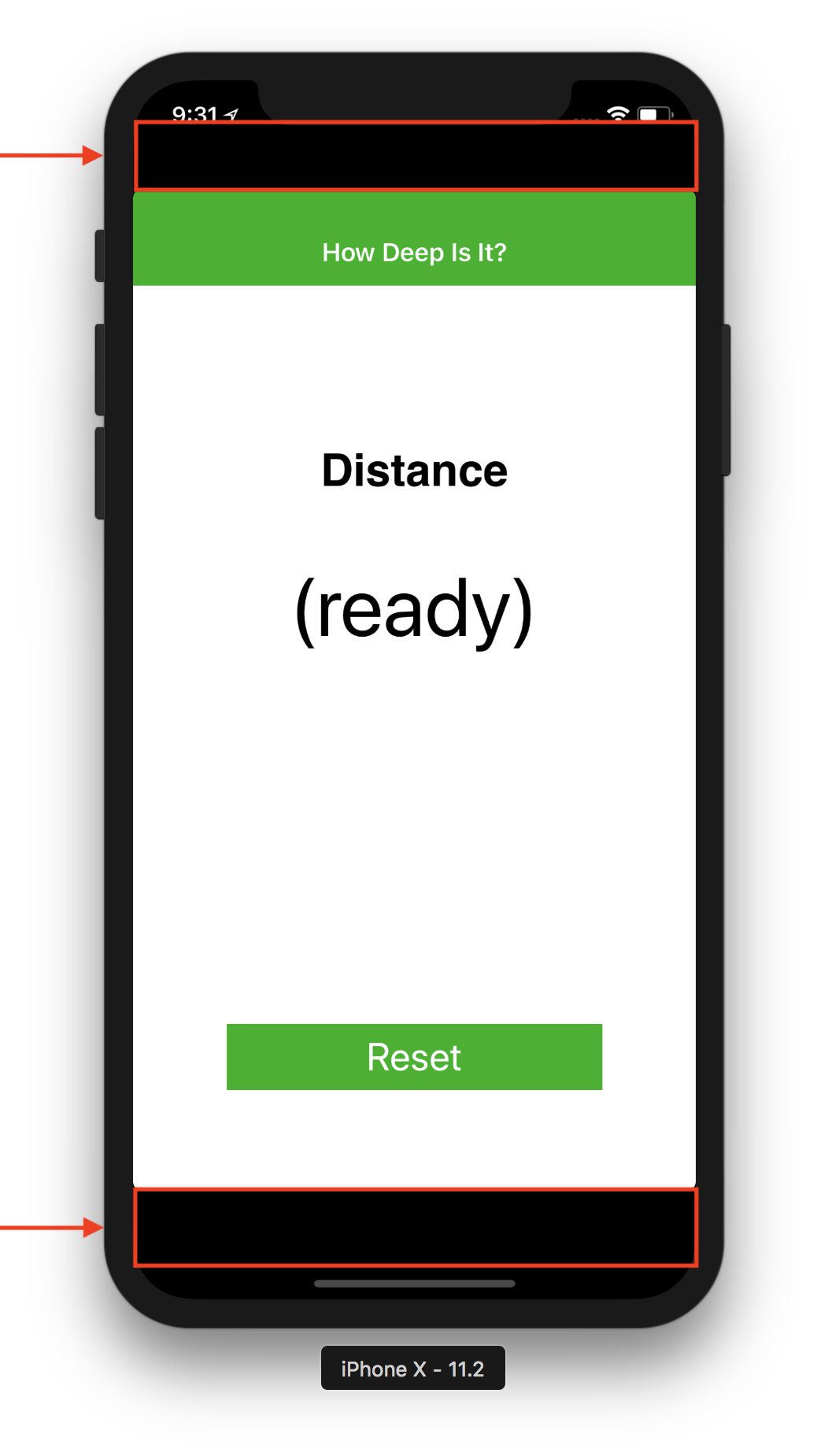
With that nice screen comes some extra space. Space that all my old apps don't understand how to make use of. I've found myself struggling to remember each time how exactly to take advantage of that space, so here are the steps.
Most of us are familiar with this screen, where we can specify a Launch Screen image for each device size, type (iPhone, iPad, Apple TV), and screen resolution, like Retina HD 5.5 (iPhone Plus) and Retina HD 4.7 (iPhone 6 and up)
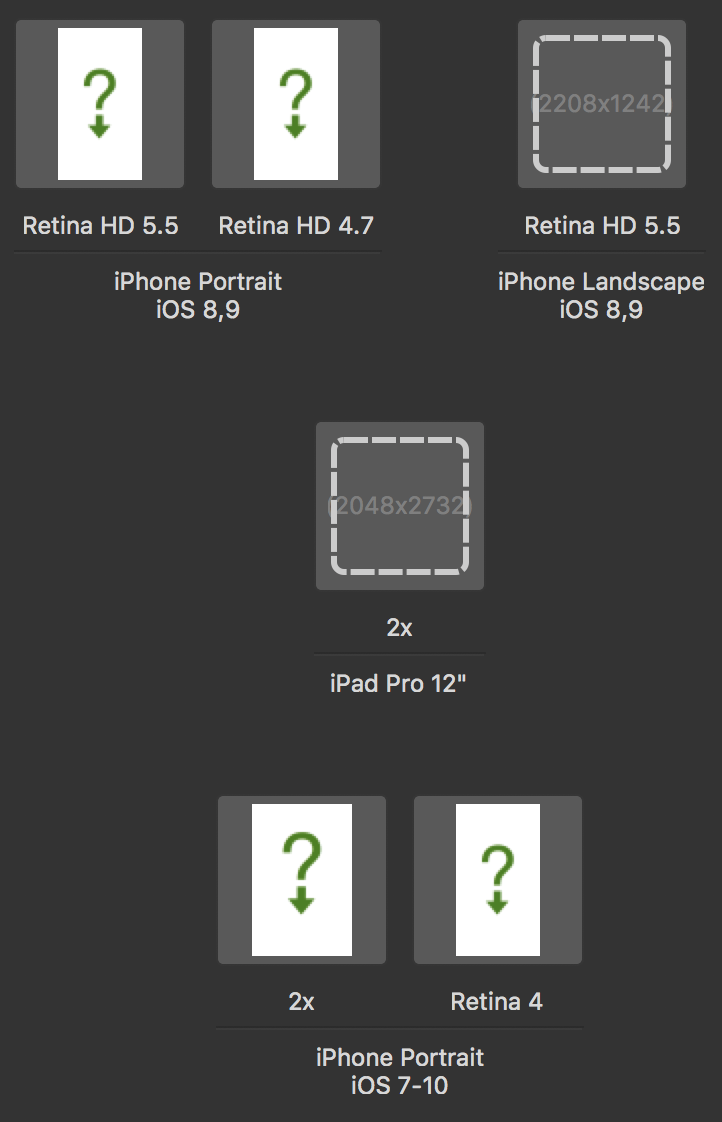
We’d expect it have a spot for the new iPhone X, named something like “Super Retina HD 5.8”, but there isn’t an option for iPhone X here. If you want your app to expand into that new space above and below, you must create a Launch Screen Storyboard. For those that are more familiar with Xamarin.Forms apps, this may be foreign, but don’t worry.
As of iOS 8, we’re now able to use a single Unified Storyboard to make a Launch Screen that looks correct in all cases. I’ve just never done it until needing to support iPhone X.
Let’s Do It
Start by right-clicking on your project in Visual Studio for Mac and select Add > New File
In the dialog, choose > iOS (on the left panel) > Launch Screen. The default name “LaunchScreen” is just fine, but can be named anything.
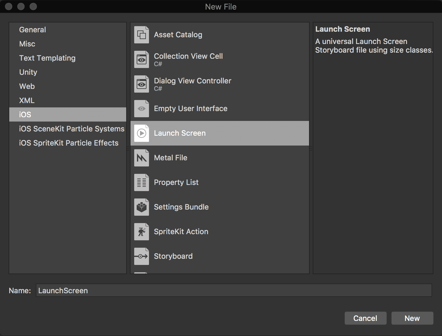
From here, I’d suggest following steps 2 - 8 in this guide from Xamarin, on how to design the storyboard and place a launch image/icon. Then come back here when they start to talk about constraints.
One tip:
- If for some reason your app already has a storyboard in it, after creating the new LaunchScreen storyboard, you may not see “LaunchScreen” appear in the Launch Screen dropdown box when editing your Info.plist file. Quit Visual Studio for Mac and relaunch it and open your solution again. It should now appear.

Centering Launch Images
Okay so, you’ve got a basic launch screen storyboard created now.
My launch screens are pretty simple. It’s just my app icon on a solid colored background.
I’ve found an easy way to make your launch image/icon be centered on all device sizes without messing with constraints. Follow these steps:
-
With your Image View selected.
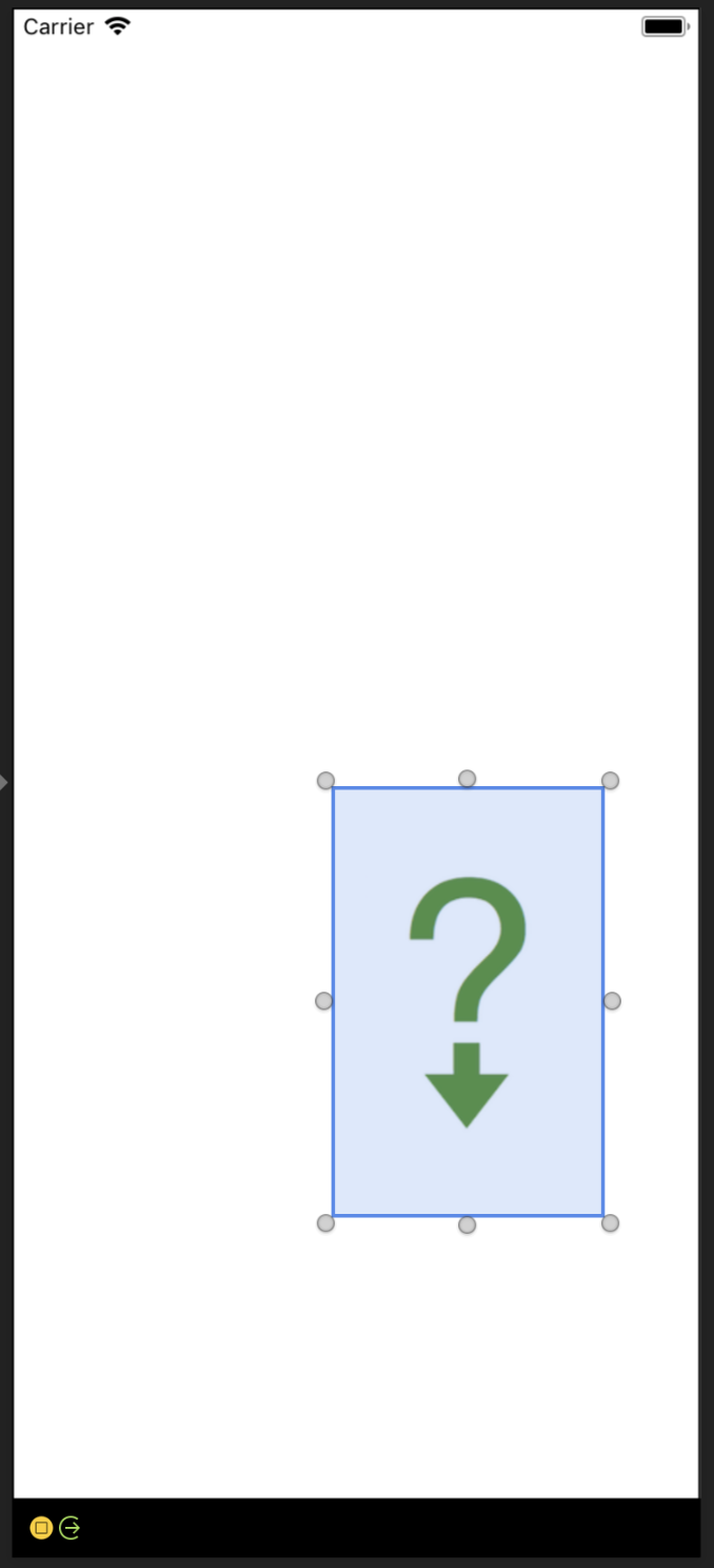
-
Click the Center and Middle buttons next to Position in Parent
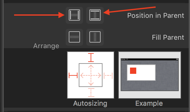
This will center the image in the middle of your current device view. -
Click on these red line segments to remove them
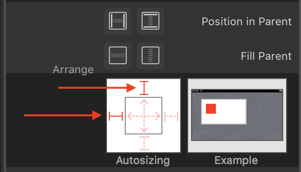
Now your image will stay centered on all device sizes -
If your image is of high enough resolution, you can also click on the dashed arrows inside the box to allow it to be autosized on larger/smaller screen sizes.
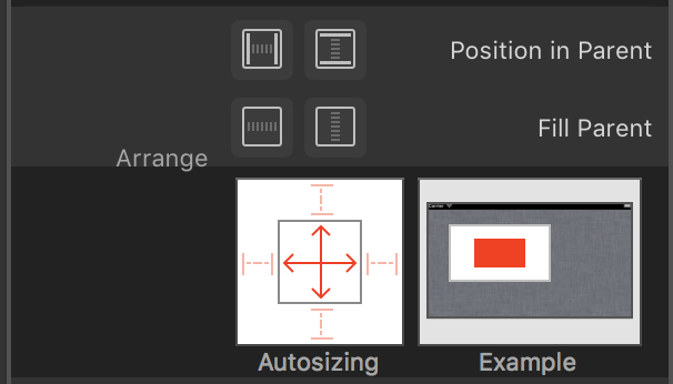
The Results
Ah, that’s much better! Look at all those good looking pixels being put to use!
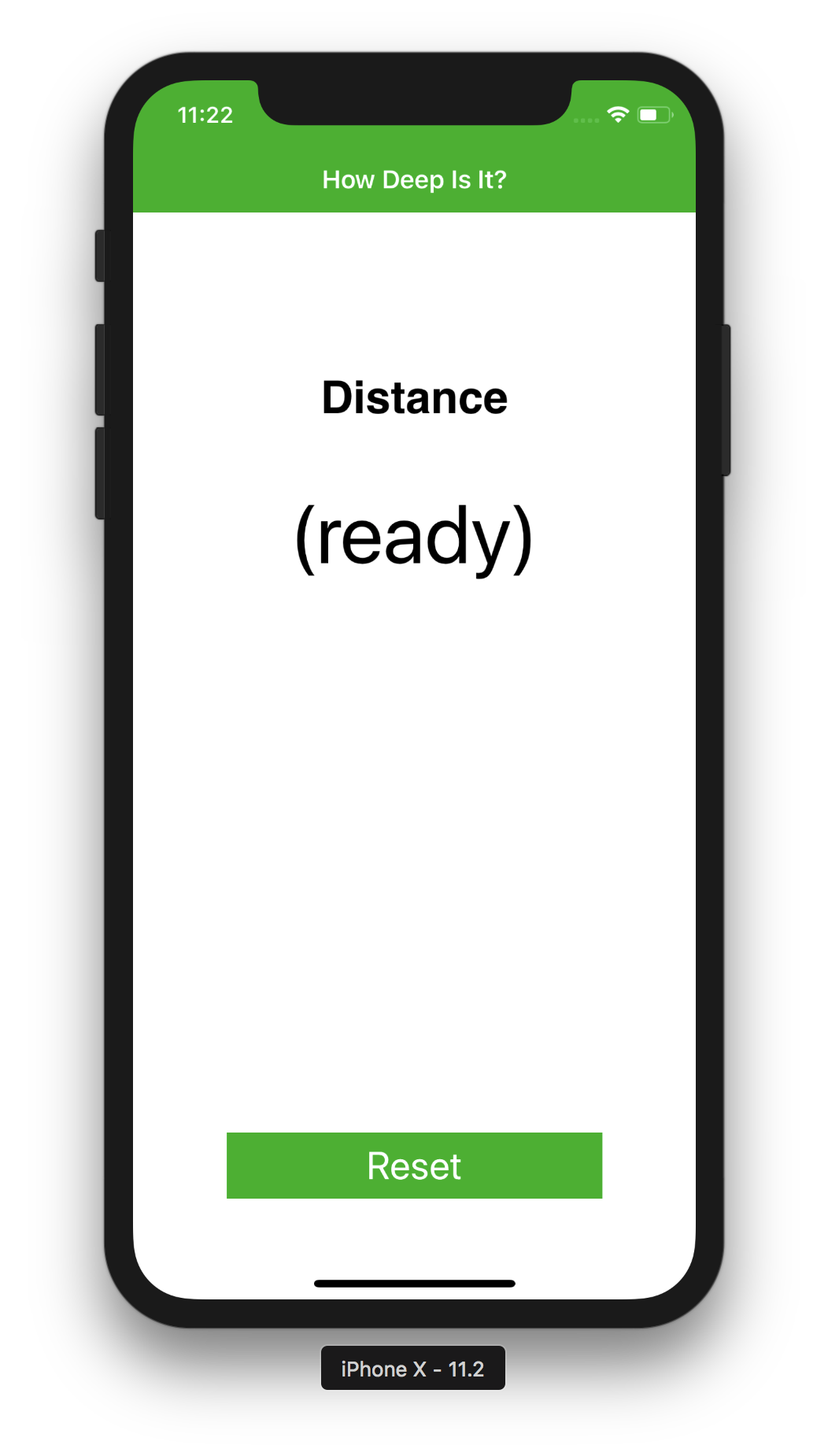
Mind the iPhone X Safe Areas
The iPhone X is unique in that it features an all new on-screen home indicator bar in place of the physical home button, the “notch” sensor housing, and rounded screen corners. You’ll probably want to check that your layouts are “safe” and make sure that content isn’t being clipped by any of these device-specific features.
See this great post about it on the VS App Center blog
See these Xamarin blog posts for Xamarin.Forms apps and iOS apps